Premiere Video Project:

Celebrities through social media

Over the course of the week my group and I came up with a video project focusing on the impacts that celebrities have on society through social media. Within our group each member was assigned a different role to help create the video. My role specifically included: finding music, editing together interviews, and adding text. Working together on premiere was a little tricky in the beginning because taking out the hard drive often resulted in our videos being unable to play. However, after receiving help we were able to organize our videos in folders and neatly place them into one coherent video. I had so much fun researching on the celebrities Shay Mitchell and Cameron Boyce. Overall, this project exposed me to a new editing application that was different than what I have ever used before.

Flyer Critique:

https://www.governorsballmusicfestival.com/lineup/


Governors Ball Flyer

  • I chose this flyer because my favorite festival to attend is Govball. This is a multi-stage music festival in New York City that caters towards music and food lovers. This year’s 2019 flyer was largely focused around the neon trend with pops of bright colors. I loved that the flyer featured the artists performing for each day and the location of the event. However, if I were to change one thing I would change the font and size of the artists names. Personally, I find it overwhelming to have numerous names so closely together in such long font. Overall, I really like the display of this flyer.

Blog Critique:

Declan Leonard

rackettime.sport.blog/

The good on Declan’s blog…

From the start, I got the wonderful impression that he loved tennis from the vibrant colors and picture on his home page. With clear and simple text it was really easy to navigate and read his work. With this, he had a functioning menu bar that made it easy to view each page. Also, I liked how he included videos to his blog to further highlight specific tennis matches.

The bad on Declan’s blog…

To make his website even better, I think Declan could have included more pages on his hobbies and interests with additional photos to craft a more personalized blog.

Website Critique:

Today I’ll be going over and critiquing two different websites highlighting the good and the bad of each!

Drunk Elephant vs. Macy’s

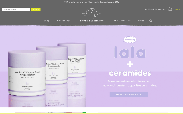
Drunk Elephant:


The Good

  • Large images for users to clearly see each product
  • Pops of bright color and use of emojis utilized to highlight certain deals and new products
  • Simple videos to show and explain how each product is used and its purpose
  • Real pictures and reviews from customers listed on website
  • Awards, ingredients, and philosophy categories are shown under each product to benefit the customer

The Bad

  • Light background colors make it unclear and hard to read text
  • Too many words in such small font all over the website
  • Some bugs in the website in regard to clicking a close up image of a product
  • Certain products didn’t have videos to show the item

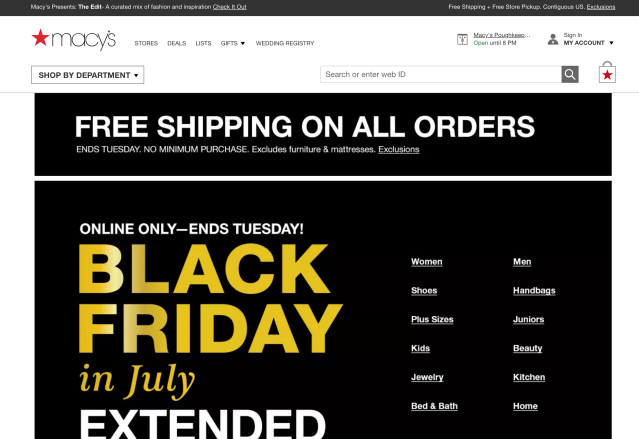
Macy’s:


The Good

  • Easy access to all categories provided on front page
  • Arrows accessible to automatically go to the top of any page
  • Promotions listed in big print on the home page
  • Similar products show up after a user clicks on something they like or add to the cart

The Bad

  • The home page was all black and unappealing
  • Website took a while to load certain items or images
  • Bland/ no color on all pages
  • No elements move or rotate creating a bland look
Create your own website, free on WordPress.com.Create your own website.
Start free