Today I’ll be going over and critiquing two different websites highlighting the good and the bad of each!
Drunk Elephant vs. Macy’s
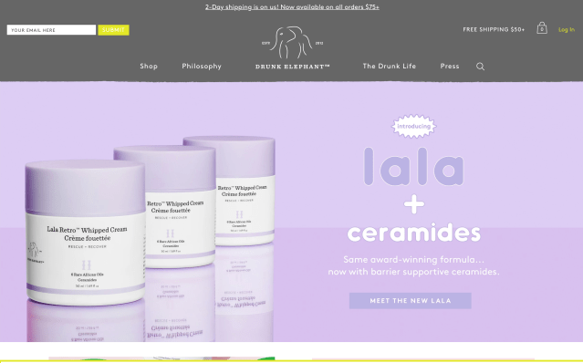
Drunk Elephant:
The Good
- Large images for users to clearly see each product
- Pops of bright color and use of emojis utilized to highlight certain deals and new products
- Simple videos to show and explain how each product is used and its purpose
- Real pictures and reviews from customers listed on website
- Awards, ingredients, and philosophy categories are shown under each product to benefit the customer
The Bad
- Light background colors make it unclear and hard to read text
- Too many words in such small font all over the website
- Some bugs in the website in regard to clicking a close up image of a product
- Certain products didn’t have videos to show the item
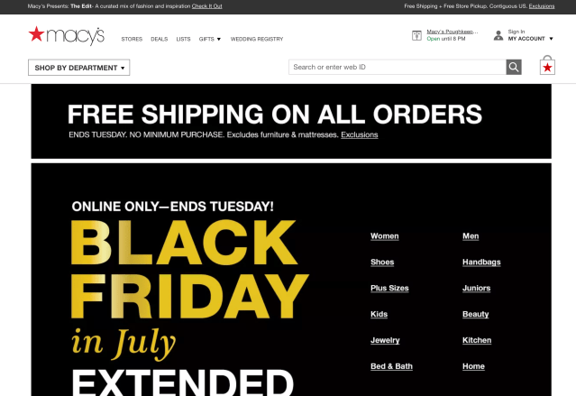
Macy’s:
The Good
- Easy access to all categories provided on front page
- Arrows accessible to automatically go to the top of any page
- Promotions listed in big print on the home page
- Similar products show up after a user clicks on something they like or add to the cart
The Bad
- The home page was all black and unappealing
- Website took a while to load certain items or images
- Bland/ no color on all pages
- No elements move or rotate creating a bland look
